
Modern Contemporary Interior Design: Nature-Inspired Ideas for Your HDB Home
Modern contemporary interior design is defined by its clean lines, minimalist aesthetic, and harmonious spatial arrangements. It places emphasis on functionality, open spaces, and a sense of calm. While furniture and layout matter, colour is one of the most powerful elements in crafting a space that is not only beautiful but endures with time.
In the world of modern contemporary interior design, colour dictates mood, influences perception of space, and enhances architectural features. The right palette can elevate a room, making it feel spacious, light-filled, and cohesive. It can also bring warmth, personality, and texture, all while adhering to the understated elegance of the style.
This article explores eight timeless interior trends that align perfectly with modern contemporary interior design principles. Whether you’re designing a new home or revamping your current space, these palettes will provide clarity and inspiration.
Key Takeaways
Colour is central to a cohesive modern contemporary interior design.
Neutral and earthy tones bring elegance and serenity.
Accent colours provide personality while preserving a minimalist look.
Strategic colour choice enhances space, light, and ambience.
Timeless interior trends for Modern Contemporary Interior Designs
What Is Contemporary Interior Design
Contemporary design is often mistaken for “modern,” but it is in fact ever-evolving, reflecting the spirit of the present moment. Where modernism was born of the early to mid-20th century, contemporary design adapts with changing lifestyles, technologies, and values. At its core, it emphasises clean lines, open layouts, and a balance between simplicity and comfort. When paired with natural influences, contemporary interior design feels both grounded and progressive, perfectly suited for Singapore’s urban flats.
A Brief History
The story of modern contemporary interior design begins in the late 20th century, as homes moved away from the rigid rules of traditional modernism. Instead of adhering to one strict aesthetic, contemporary interiors drew inspiration from multiple movements—modern, minimalist, even industrial—while evolving to embrace sustainability and wellness. Today, it is defined by versatility and personalisation: uncluttered forms softened with organic textures, neutral palettes enriched by accents, and layouts designed for flexibility. This layered history explains why the style resonates so strongly with homeowners seeking both elegance and liveability.
Styling Principles for Modern Contemporary Homes
Designing a space with modern contemporary home design in mind is about striking harmony. It’s not about filling rooms with the newest trends, but about weaving together light, material, and form into something timeless yet current. Think earthy tones layered with texture, furniture that is both functional and sculptural, and interiors that feel uncluttered but never sparse. In practice, it’s about letting your home breathe while adding enough character for it to feel distinctly yours. The following ideas show how to bring this approach to life.
Modern Colour Schemes That Define Contemporary Living
Colour plays a central role in shaping the mood and character of modern contemporary interiors. The right palette enhances space, light, and texture, while maintaining a sense of sophistication and calm. From timeless neutrals to earthy undertones, these modern colour styles highlight how versatile contemporary design can be across every room of your home.
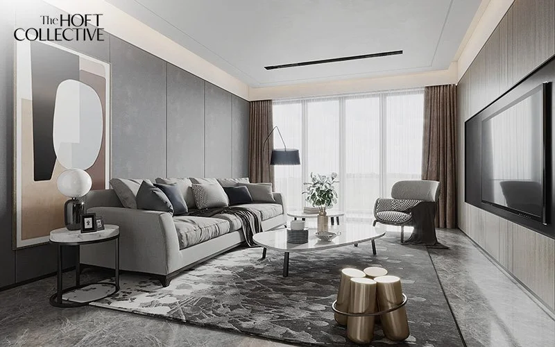
Neutral Greys and Soft Whites
Neutral greys and soft whites are the quintessential choices in modern contemporary interior design. They offer a calming, clean foundation that can be adapted to any room type: bedrooms, kitchens, bathrooms, or living rooms.
Examples:
Light dove grey walls paired with matte white cabinetry
Off-white curtains and pale grey sofas for a serene living room colour idea
Grey ceramic tiles in minimalist bathrooms with chrome fittings
These colours reflect natural and artificial light well, creating an airy, expansive atmosphere. They also pair beautifully with textured elements like exposed concrete, warm wood, and matte finishes, common features in residential interior design.
Earthy Tones: Terracotta, Clay, and Olive
Earthy colours inspired by nature—think terracotta, clay, and olive green—are making a strong return. These tones add a sense of warmth, grounding, and rustic elegance while maintaining the simplicity of modern contemporary interior design.
Examples:
A feature wall in clay red with neutral-toned accessories
Olive green kitchen cabinetry with bronze handles
Terracotta pots and clay-coloured throws in a neutral bedroom interior colour scheme
Earthy palettes pair exceptionally well with natural stone, raw timber, and woven textiles, creating a warm yet understated style that feels both inviting and sophisticated. These colours—such as terracotta, clay, olive green, and warm browns—bring the outdoors inside, fostering a sense of connection to nature that enhances wellbeing.
In modern contemporary styling, incorporating these tones adds depth and texture without overwhelming minimalist spaces. This approach works beautifully even in small condo design apartments, where careful layering of materials like stone countertops, wooden flooring, and woven rugs can maximise visual interest while maintaining a cohesive, serene environment. Using earthy palettes encourages a tactile, sensory experience, making the space feel grounded and timeless while still embracing contemporary aesthetics.
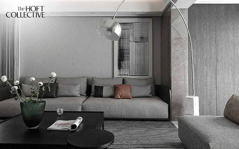
Monochrome Black and White
A black and white scheme is bold yet timeless. It provides high contrast, clean lines, and dramatic flair, perfect for anyone who prefers a minimalist aesthetic with personality. This striking contrast is a hallmark of modern contemporary styling, offering visual drama while maintaining balance.
Examples:
White walls with black-framed glass partitions
Black kitchen islands with marble countertops
Monochrome artwork or rugs that ground an otherwise light space
This palette works exceptionally well in open-plan layouts and is frequently seen in landed house interior design, where scale and proportion allow bold contrasts to shine. It’s a classic colour approach that complements the clean, streamlined nature of modern contemporary interior design.
Navy Blue and Deep Teal Accents
Navy blue and deep teal evoke luxury and calm. They are bold yet sophisticated choices for accent features that still align with a minimalist palette.
Examples:
Deep teal wall panels in a study or home office
Navy blue velvet dining chairs paired with a white marble table
Teal-coloured bed linen against a beige backdrop for a balanced bedroom interior colour style
These shades work best as accent colours in smaller doses across both residential interior design and commercial settings, especially when creating depth in a modern contemporary interior design framework.
Warm Beige and Sand Tones
Beige and sand tones convey warmth and tranquillity, essential for creating a relaxing home environment. These colours offer a soft, sunlit foundation that makes any room feel grounded, spacious, and serene. In modern contemporary interior design, they are particularly effective in creating seamless transitions between rooms, especially in open-plan layouts where visual continuity is key.
Examples:
Sandy beige walls in a living room with large windows to maximise natural light.
Light oak flooring combined with beige furnishings.
A beige-toned feature wall in a minimalist small condo design.
These hues are remarkably versatile. They can be paired with pastel accents, bolder tones like charcoal or navy, or even wood-inspired textures such as walnut or ash. In homes styled with Scandinavian, coastal, or Mediterranean influences, beige and sand tones act as calming neutrals that support other design elements without overpowering them. Their understated beauty allows furniture and décor to take centre stage while providing an ever-elegant canvas that never goes out of style.
Pastel Pops: Blush Pink, Sage, and Powder Blue
Pastels add gentle vibrancy to a space, introducing subtle personality without overpowering it.
Examples:
Blush pink kitchen cabinetry with brass handles.
Sage green bathroom walls with white ceramics.
Powder blue cushions on a neutral grey sofa in a family living room.
These colours are ideal for children’s rooms, kitchens, or modern bathrooms in residential interior design. They offer a playful touch while still fitting within the refined aesthetic of modern contemporary interior design.
Charcoal and Slate for Moody Sophistication
Charcoal and slate offer depth and a moody elegance that is very much in line with modern contemporary interior design.
Examples:
A charcoal grey media wall with built-in lighting.
Slate-coloured kitchen countertops with white or wooden cabinetry.
Slate grey cabinetry in a master ensuite bathroom paired with brushed steel finishes.
These darker tones are excellent for larger rooms or accenting high ceilings in landed house interior design.
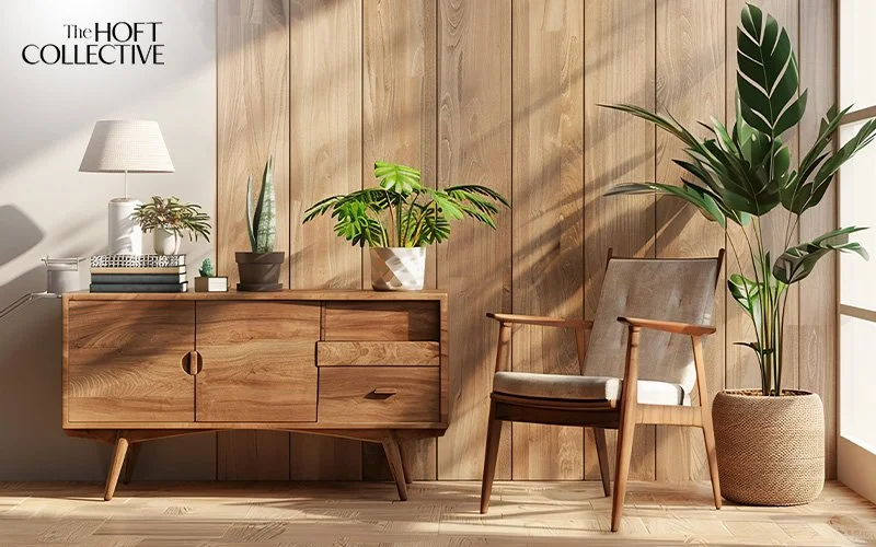
Wood-Inspired Colours: Walnut, Oak, and Ash
Wood tones provide both texture and warmth. While wood is a material, its hues are essential parts of any colour palette.
Examples:
Walnut-toned floors with cream or white walls.
Light oak furniture against muted sage green walls.
Ash-toned wall panelling in a modern dining area.
These colours integrate naturally with all other palettes and are universally applicable in small condo design or larger properties.
Modern Contemporary Design for Every Room
Applying modern contemporary interior design ideas throughout the home ensures consistency while allowing each room to reflect its own rhythm. From communal spaces like living rooms and dining areas to private sanctuaries like bedrooms and bathrooms, the style adapts effortlessly. Here’s how it unfolds across your home.
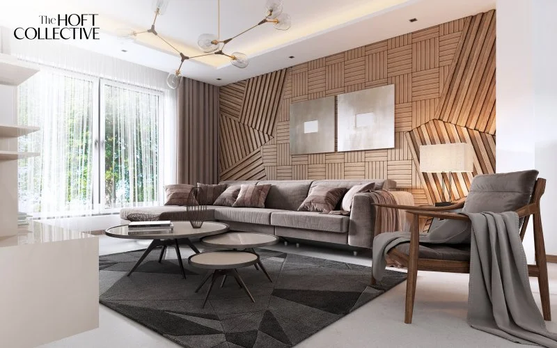
Living Rooms with Balance
Anchor the space with streamlined seating, then pair it with sculptural tables or a statement floor lamp. Natural finishes, such as timber, stone, and linen soften the look, while open layouts keep the room fluid and social. A modern contemporary living room thrives on balance: warm yet uncluttered, functional yet inviting.
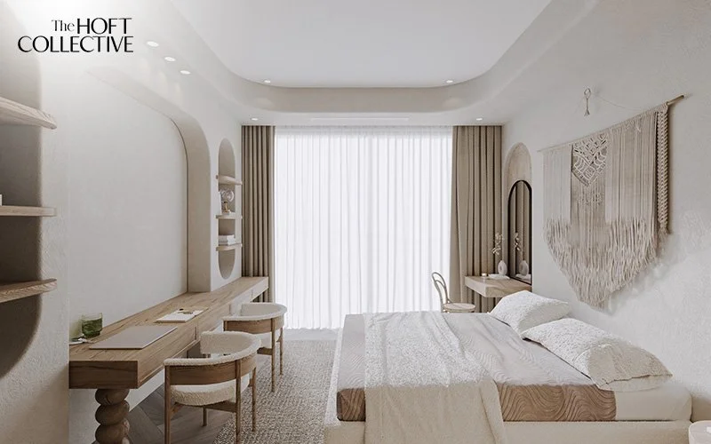
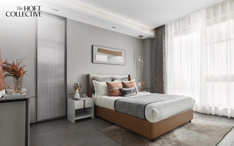
Bedrooms for Rest and Renewal
In bedrooms, modern contemporary interior design leans towards calm minimalism. Choose a simple bed frame in wood or upholstered fabric, and surround it with muted tones like soft grey, beige, or taupe. Layer with linen bedding or a wool throw to add comfort without excess. The goal is a restful sanctuary where light and space feel unbroken.
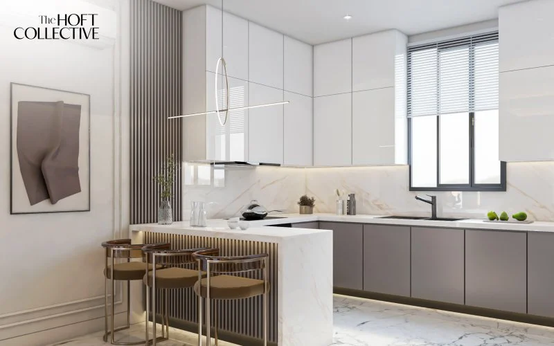
Kitchens with Flow
Contemporary kitchens favour clarity and seamless movement. Handle-less cabinetry, sleek counters, and integrated appliances allow function to disappear into form. Introduce warmth with wooden finishes or textured tiles, and keep colour palettes restrained so the space feels fresh and uncluttered.
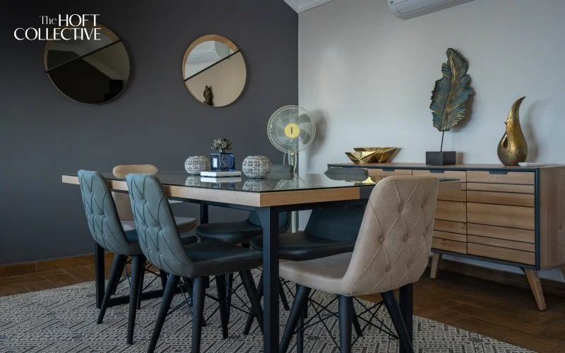
Dining Rooms that Invite Conversation
The dining area thrives on simplicity with purpose. A solid dining table in natural wood or stone becomes the focal point, surrounded by clean-lined chairs. Overhead, a pendant lamp in muted tones creates intimacy. This is a space designed for both function and atmosphere, where shared meals feel elevated without being overstyled.
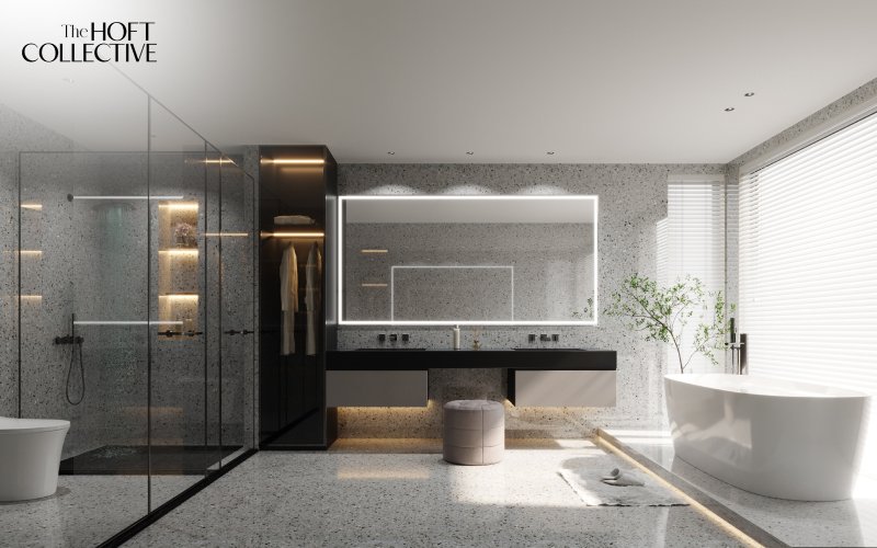
Bathrooms as Everyday Retreats
In bathrooms, calm and clarity should be the main emphasis. Floating vanities, frameless mirrors, and walk-in showers open the space, while stone, timber, or matte finishes add warmth. Keep accessories minimal, ranging from folded towels to a potted plant, for a spa-like quality that feels restorative every day.
Making Colour Choices Work in Your Space
Balance and Contrast: Mixing Tones Correctly
Achieving harmony in modern contemporary interior design depends on the right mix of contrast and balance. While neutral tones provide calmness, contrast adds depth and visual interest.
For example, pairing dark navy cabinetry with soft white walls can bring focus without visual overload.
Mix warm tones like beige with cool greys for pleasant tension.
In a living room, you might combine a soft olive sofa with slate-coloured curtains to balance earthiness and boldness.
If you're designing a small condo in Singapore, using light colours on walls with darker accents in furniture can visually expand the space. The key is to layer tones thoughtfully to maintain cohesion and flow.
Material Pairings and Lighting Considerations
Colour is deeply affected by the materials it accompanies and the type of lighting in the space.
Soft white walls may appear bluish under fluorescent lighting, but warm and creamy in natural sunlight.
Matte finishes absorb light, lending depth to rich colours like teal or terracotta.
Glossy surfaces reflect light, making lighter tones such as beige or pastel appear even brighter.
Try pairing clay-toned walls with matte black hardware in kitchens or bathrooms for an elegant and earthy look. In contrast, use light-reflecting materials in a small condo design to help bounce light across limited spaces.
It's vital to test your colour selections in the actual space with swatches. Observe how the colours look throughout the day, as natural and artificial lighting change their appearance.
Adapting Colours to Singapore’s Tropical Climate
In Singapore’s warm and humid climate, it's important to choose colours that feel fresh and airy. Lighter tones like soft whites, sage green, and sandy neutrals help maintain a cooling effect indoors. These hues also pair well with natural ventilation and abundant greenery, contributing to a serene and comfortable atmosphere, perfect for small condo design.
Colour Zoning for Open-Concept Living
In open-plan residential interior design, using different colour tones can help define zones without the need for partitions. For example:
A warm beige in the dining area paired with a navy blue accent wall in the living room.
A soft grey backdrop in the kitchen that transitions into pastel shades in adjacent spaces.
This technique adds subtle structure and flow, supporting both function and form in landed house interior design or compact layouts.
Frequently Asked Questions
Can I mix different wood tones in a modern contemporary space?
Yes, mixing wood tones is entirely acceptable as long as the undertones are consistent. For instance, walnut and oak both have warm undertones and can be layered effectively in the same space. A walnut dining table with oak flooring can add visual texture and richness, especially when grounded by a neutral base like soft white or grey. Avoid clashing cool and warm tones unless it’s intentional and well-balanced.
Are bold colours acceptable in a modern contemporary interior design?
Yes, bold colours such as emerald green or royal blue can be used as accents in modern contemporary interior design. The key is moderation. Consider a single accent wall in navy blue, or burnt orange bar stools in an otherwise neutral kitchen. Bold hues add character without compromising the minimalist core.
How do I make a small space feel larger with colour?
Lighter tones like soft whites, beige, pastel blue, and blush pink are excellent for visually expanding small rooms. In a small condo design, combining these with reflective materials like mirrors or light-toned woods can maximise brightness and openness. Avoid using too many dark shades, which can make a space feel enclosed.
What’s the difference between modern and modern contemporary interior designs?
Modern design typically refers to mid-century aesthetics with clean lines, wood elements, and a limited colour palette. Modern contemporary interior design, on the other hand, is more fluid—it incorporates current trends, a broader range of materials, and more flexibility in colour choices. It allows for more customisation while retaining simplicity.
Can pastel colours work in a masculine interior?
Yes, pastels can be styled to suit masculine spaces by pairing them with darker, structured elements. For instance, powder blue walls with charcoal grey furniture create balance. Add black or metal accents to ground the softness of pastels, achieving both elegance and edge.
Which colour style is best for a minimalist HDB renovation?
For minimalist HDB renovations, soft whites, light greys, and warm beige are the most effective. These colours enhance spatial perception and match well with built-in cabinetry and compact layouts. Accent with navy or sage for subtle contrast.
How can I maintain a cohesive colour scheme throughout my entire home?
To maintain a cohesive colour scheme, begin by choosing a base palette of two to three core colours that reflect your preferred aesthetic, such as warm neutrals or muted greys. Apply these consistently across different rooms to establish visual unity. You can then introduce variety with accent colours or textures that suit each room’s function, like calming tones for the bedroom and bolder hues in the living room. Using consistent materials (e.g., oak flooring or matte black fixtures) also helps tie everything together, particularly in modern contemporary interior design, where balance and flow are essential.
Designing with Colour for Timeless Elegance
Choosing the right colour palette is crucial to achieving a timeless, modern contemporary interior design. From the simplicity of soft whites and greys to the richness of earthy tones and wood-inspired hues, these eight colour styles provide a strong foundation for any space.
Whether you’re working with a small condo design, planning a large landed house interior design, or transforming your current space, these palettes offer flexibility, beauty, and longevity. Pair them with the right materials, lighting, and contrast techniques to enhance both aesthetics and functionality.
Ready to bring your vision to life? Visit Hoft Interior today and let our team of professionals help you create a personalised modern contemporary interior design that’s tailored to your lifestyle and tastes.